Recruiters Scan. The Pattern Is Less Certain Than the Headline.
The “six-second resume” has become career-advice folklore. It creates a vivid picture: a recruiter glances at the page, follows a predictable path, and decides your future before you can take a breath.
The underlying research deserves a more careful reading.
A 2018 eye-tracking report from Ladders reported an average initial screen of 7.4 seconds in its test. The report used a two-stage setup: recruiters first reviewed resumes while unaware that they were being timed, then eye-tracking technology followed attention under laboratory conditions.
The report supports a practical conclusion: some initial reviews are very fast, and clear presentation helps.
It gives us no universal stopwatch for every recruiter, employer, role, or hiring stage.
What a Resume Heat Map Shows
Eye-tracking equipment records where a participant looks and how long the gaze remains there. Researchers can combine those observations into a heat map. Warmer colors usually indicate more or longer fixation, cooler colors indicate less, and blank areas received little recorded attention in that test.
A heat map represents the participants, documents, task, equipment, and conditions used in the study. It cannot predict the gaze path of every recruiter who opens your resume.
The recruiter’s goal also matters. A first screen for a required license will look different from a detailed review before an interview.
What the 2018 Ladders Report Found
In the Ladders report, resumes that held attention used clear layouts, visible section and job-title headings, readable fonts, short accomplishment statements, and enough white space to separate information. Relevant keywords appeared in context.
Recruiters in the study focused heavily on job titles. The report also described more even scanning along the left side of stronger resumes.
The weaker examples were cluttered, used long sentences, relied on multiple columns, and offered few visual cues to guide the reader.
These findings support sensible document design. They provide no “golden triangle,” exact second-by-second sequence, or guaranteed hot zone.
A Necessary Correction About the F-Pattern
The F-pattern comes primarily from research on how people scan web content. The Nielsen Norman Group’s explanation describes it as one of several possible patterns. It often appears when readers face dense, weakly formatted text and seek information quickly.
Other behaviors include layer-cake scanning through headings and subheadings, spotted scanning for a word or number, and commitment reading across most of the content.
A resume can produce several of these behaviors. A recruiter may scan headings, search for a certification, check dates, then read a relevant achievement carefully.
Treat the F-pattern as a reminder to create structure. Avoid treating it as a diagram of every recruiter’s eyes.
Design the First Page for Fast Understanding
The opening area should quickly establish who you are professionally, the role or specialty you offer, your level of experience, and the evidence that makes you relevant here.
For many candidates, that means:
- Name and contact details
- Clear professional headline or concise profile
- Relevant skills where useful
- Recent experience with visible titles, employers, and dates
The exact order depends on your career stage. A recent graduate may lead with education or projects. A technical candidate may need a compact skills section. A senior leader may use a brief profile to establish scope.
Make Job Titles and Dates Easy to Find
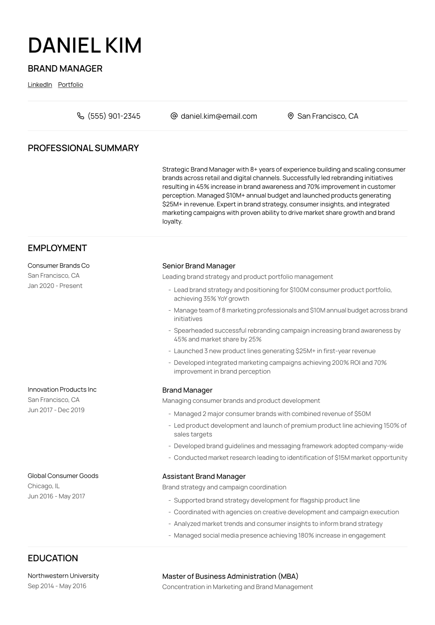
Use consistent formatting for the job title, employer, location, and dates.
Choose a hierarchy and repeat it throughout the document. A reader should recognize each role without decoding the layout.
Avoid decorative labels that obscure familiar information. “Where I Made an Impact” creates extra work when “Experience” communicates the section instantly.
Put the Best Evidence First Within Each Role
The first bullet under a job deserves strong, relevant evidence.
Weak opening:
Responsible for a variety of project management duties and stakeholder communication.
Stronger opening:
Led a €2.4 million software implementation across finance, operations, and customer service, delivering the regional launch three weeks ahead of the contractual deadline.
Use only verified figures and responsibilities. Follow with bullets that add different evidence: process improvement, technical judgment, team leadership, customer impact, or scale.
Replace Dense Paragraphs With Structure
Large blocks of prose make specific evidence harder to find. Short bullets, clear headings, consistent spacing, selective bold styling, and plain language create a more useful hierarchy.
Keep each bullet focused on one main contribution. A sentence carrying five job-description phrases will feel mechanical and slow the reader down.
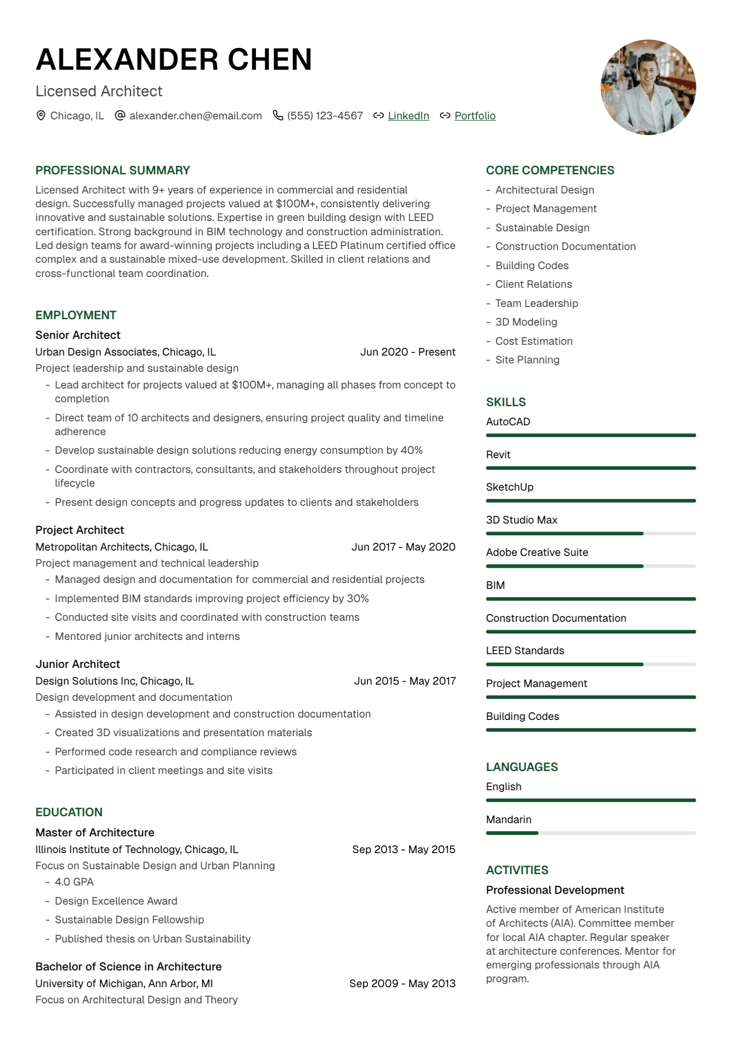
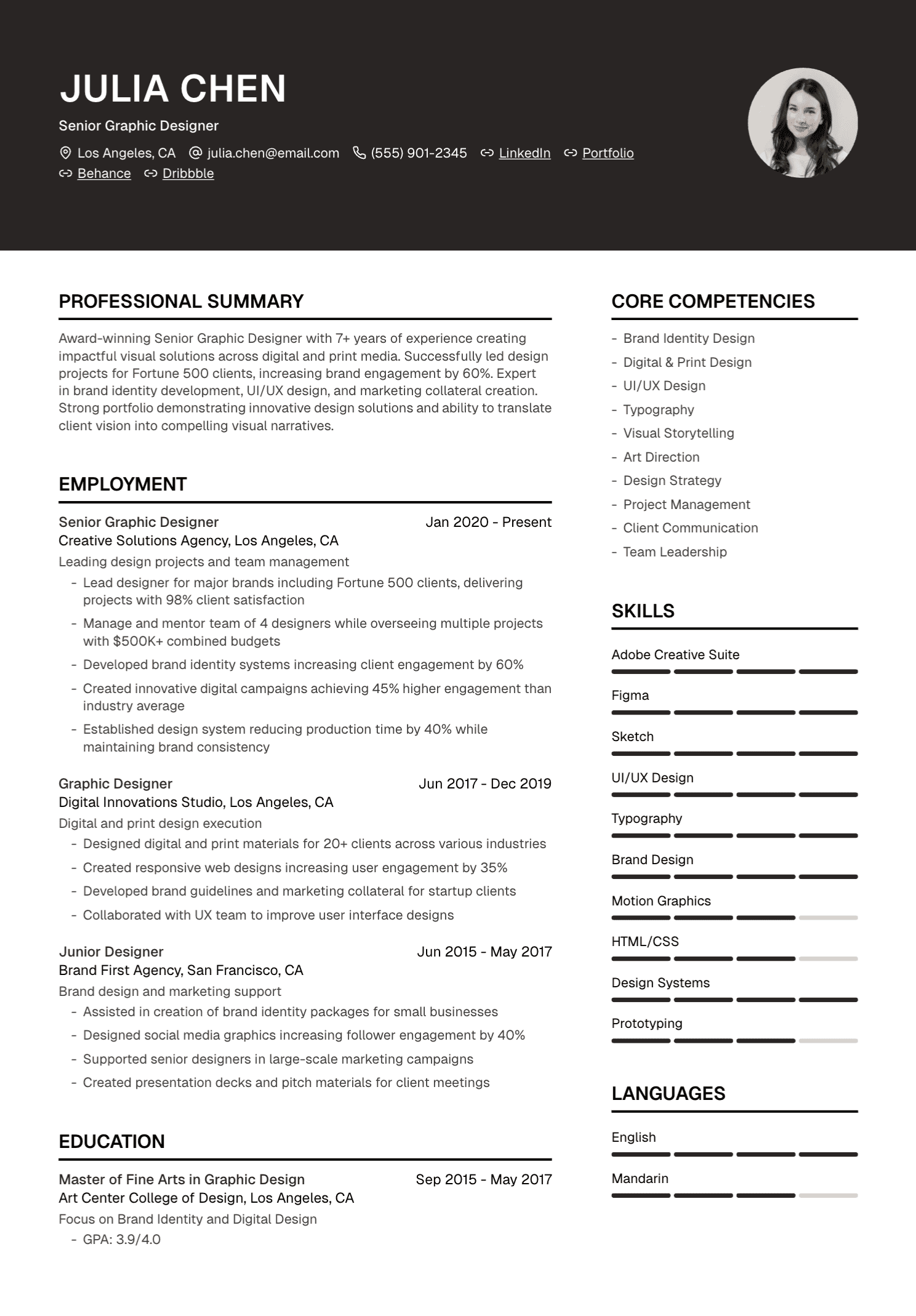
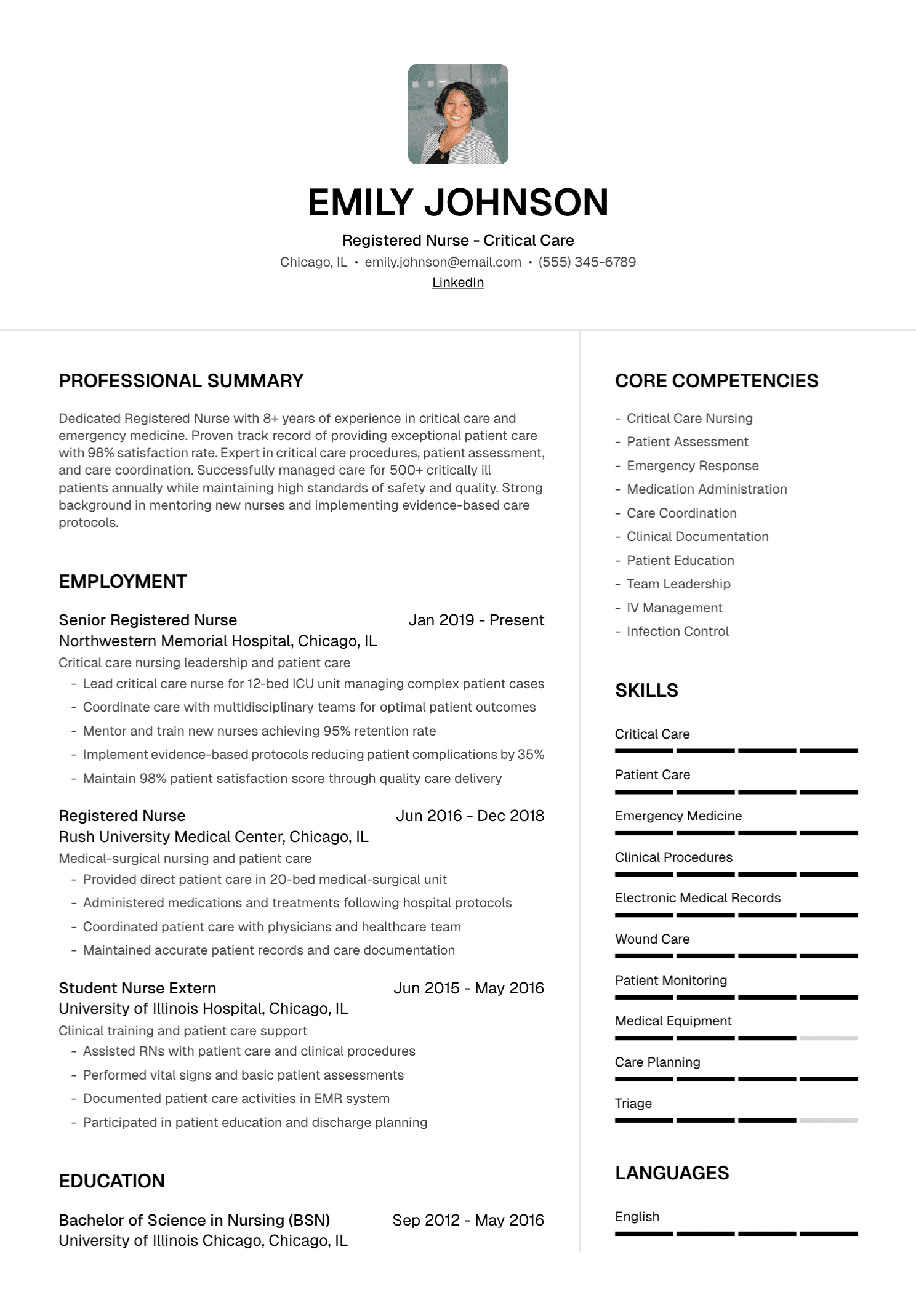
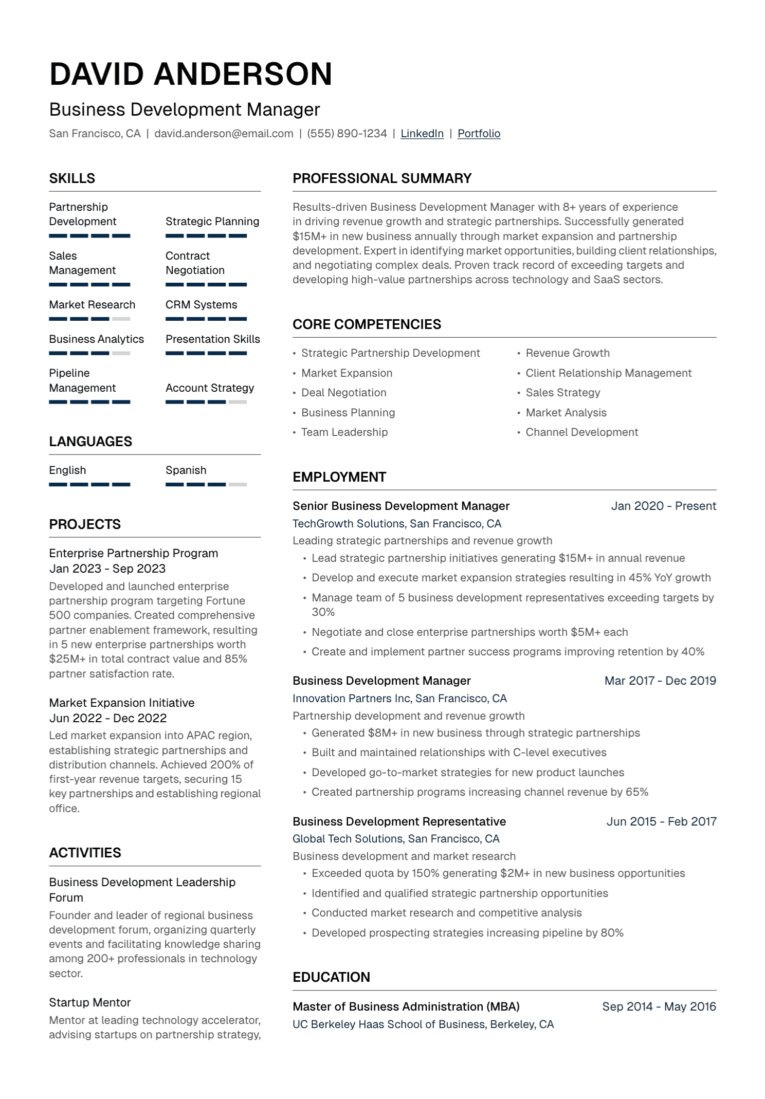
Use Columns Carefully
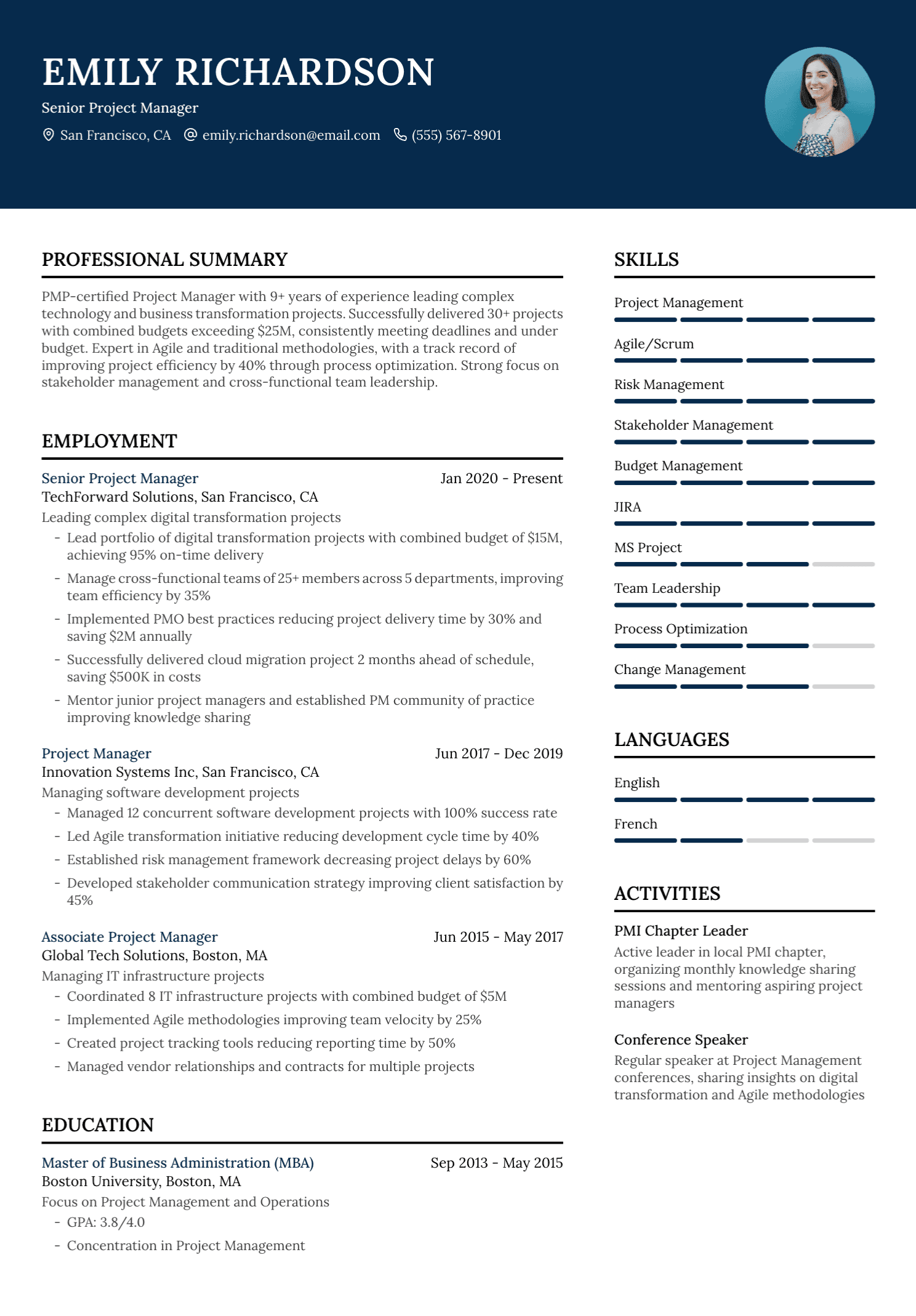
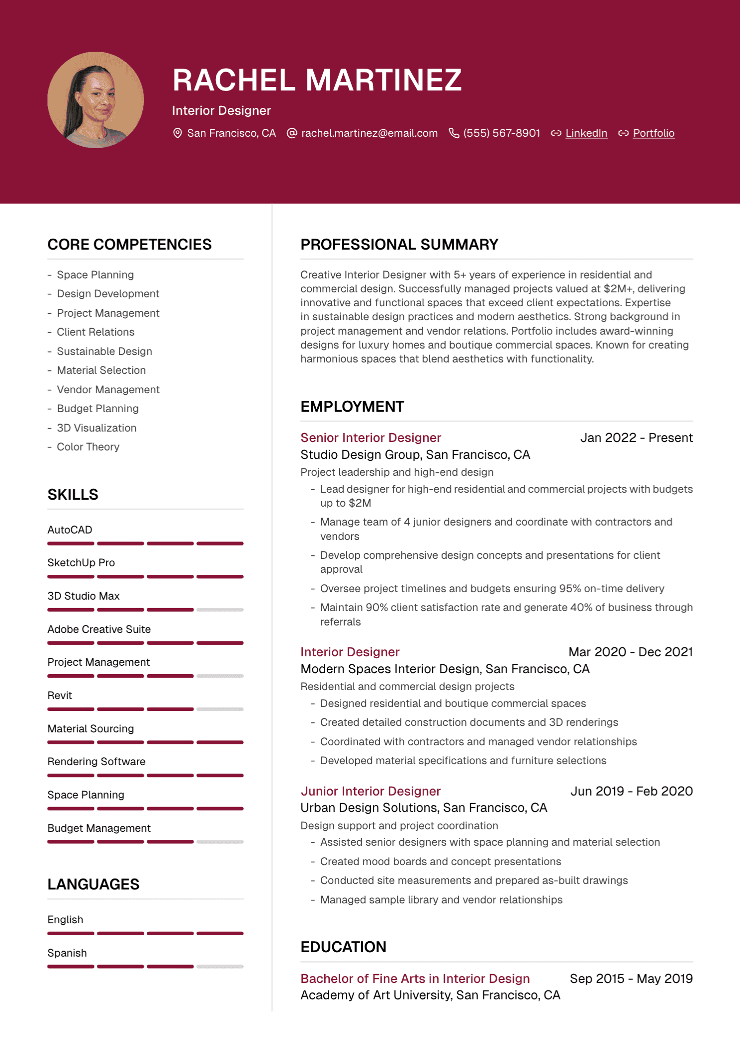
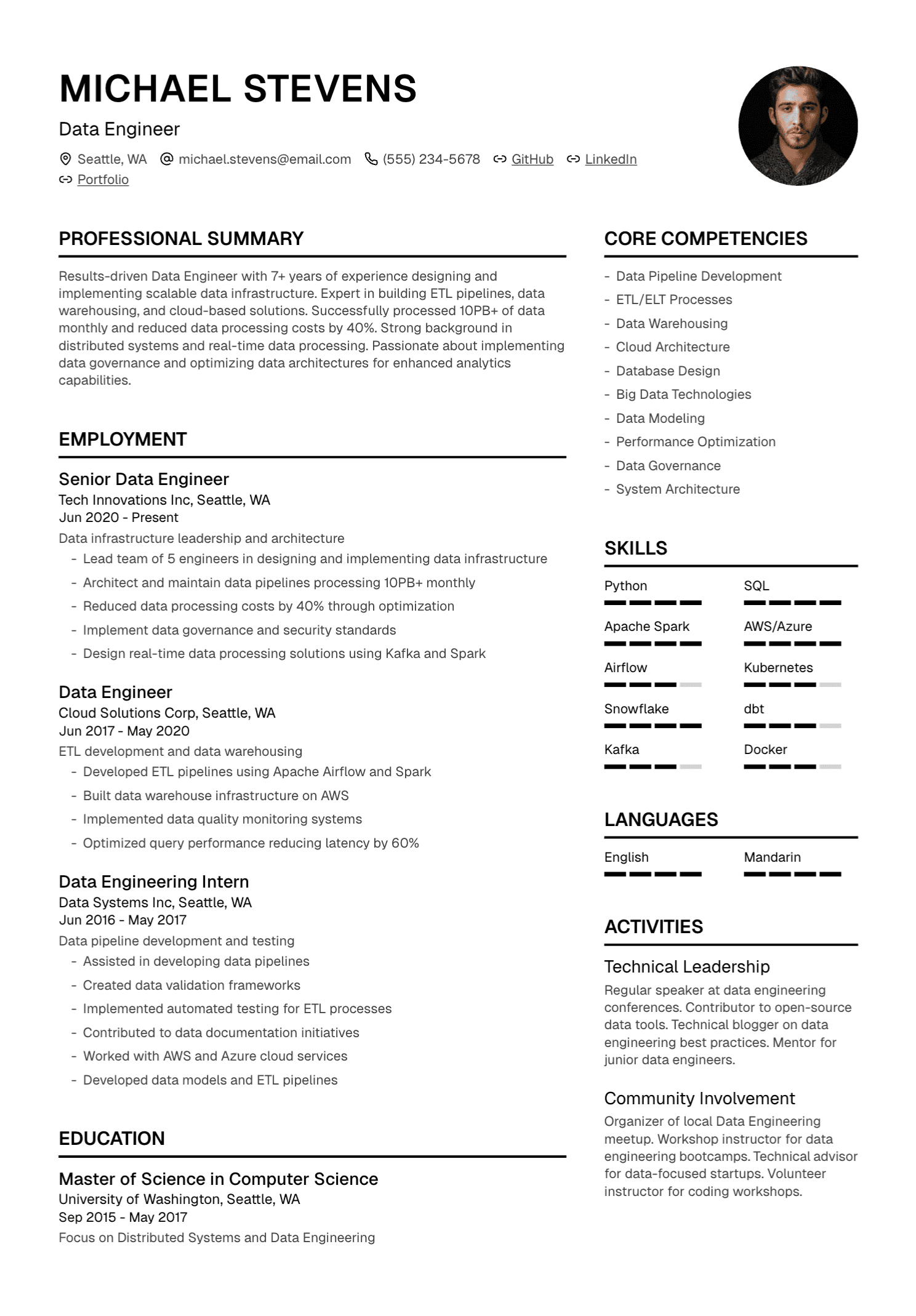
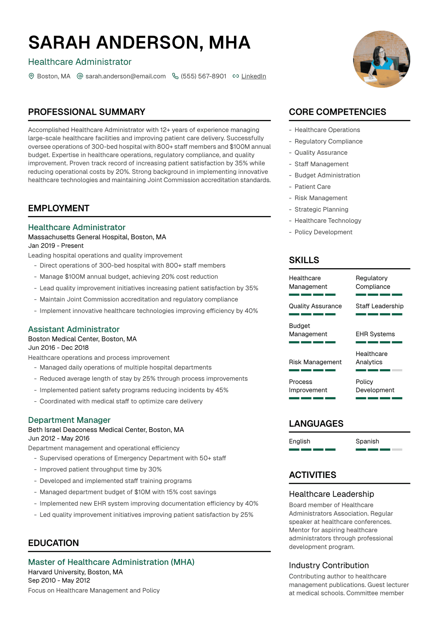
The Ladders report associated clutter and multiple columns with weaker examples in its study. Columns can also create parsing problems in some application systems, depending on how the document is built and processed.
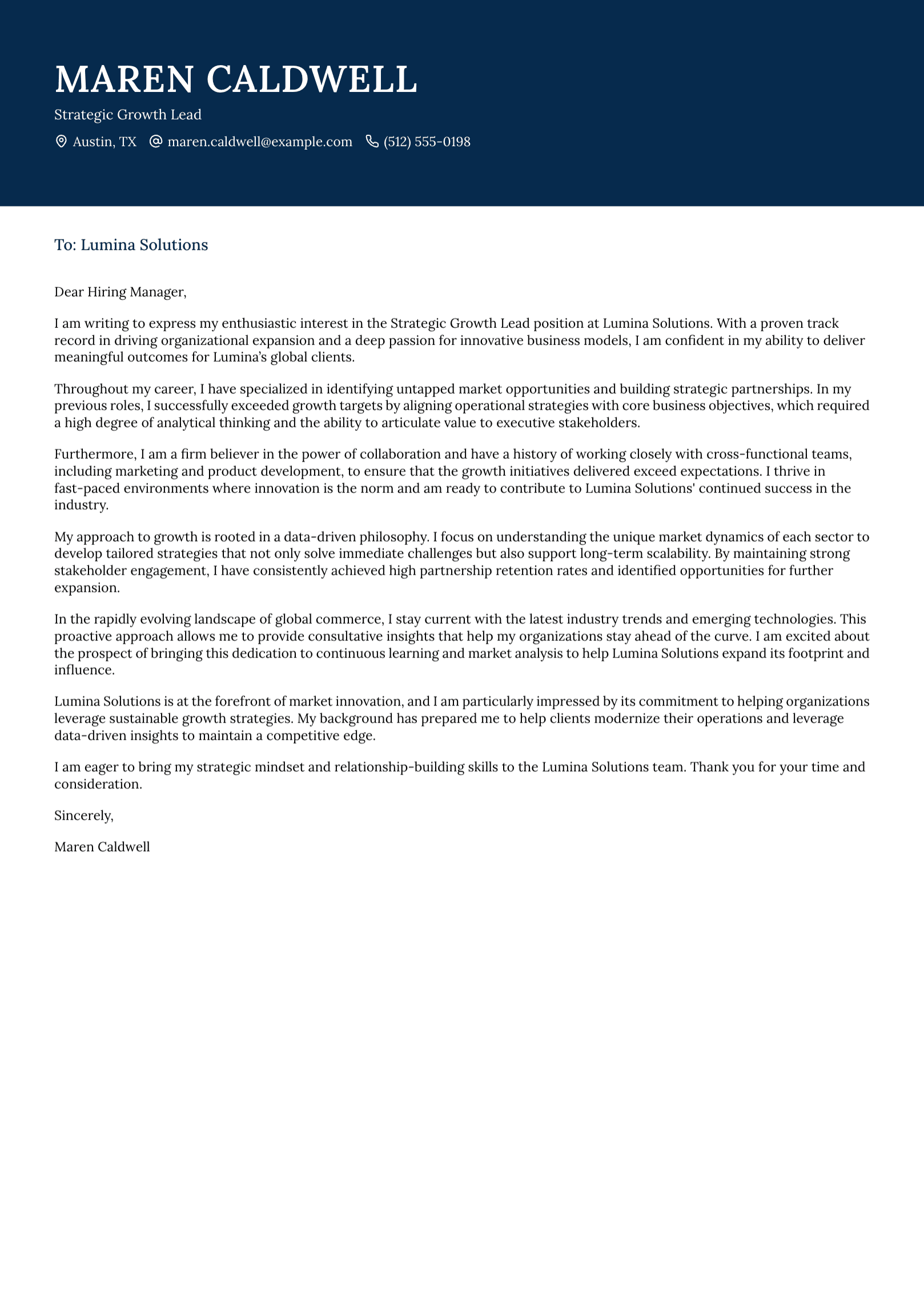
If you use a two-column template, keep essential experience in the main reading column and maintain a clear order in the underlying text. Export selectable text, test the copy-and-paste order, and review the PDF on a small screen.
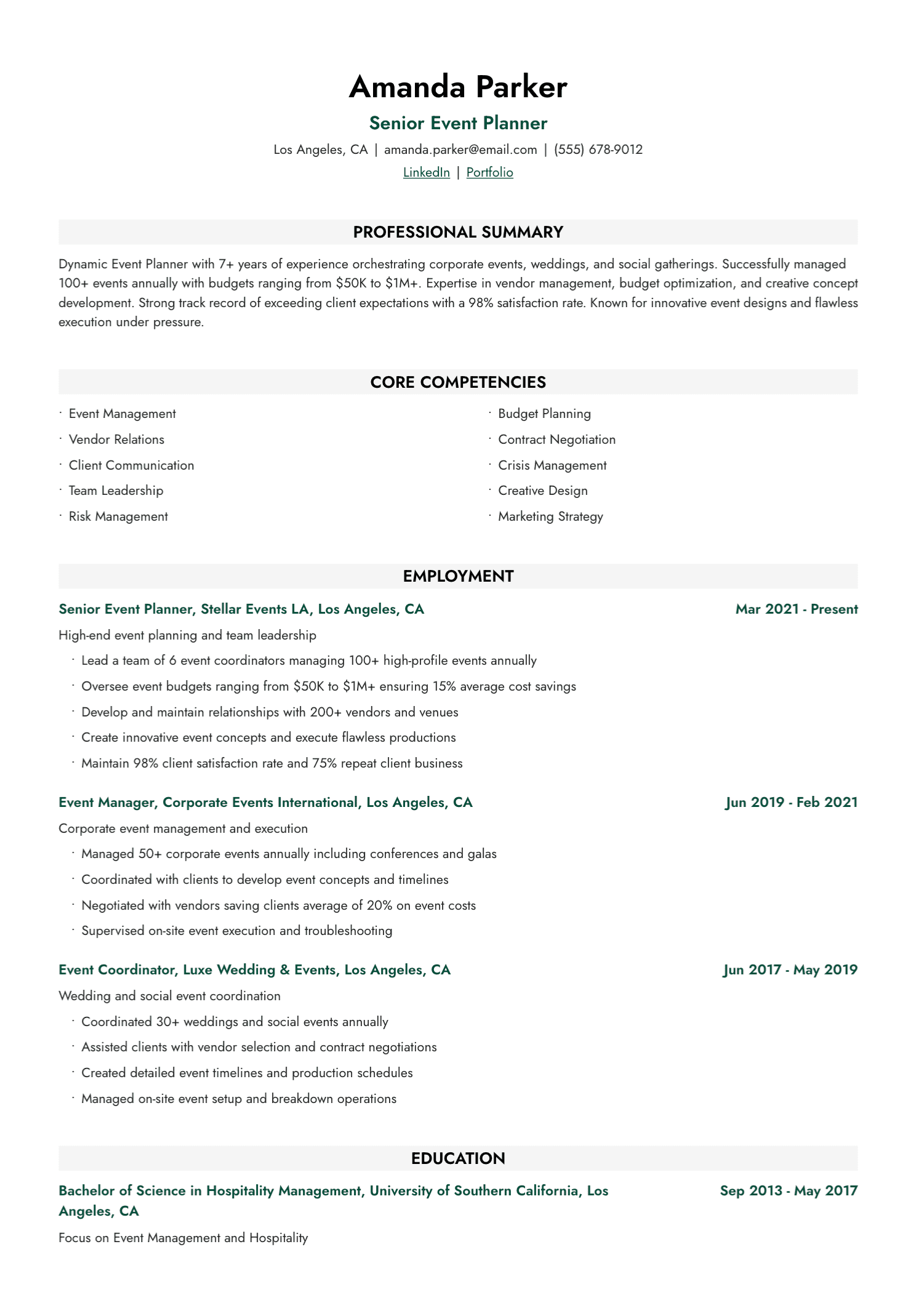
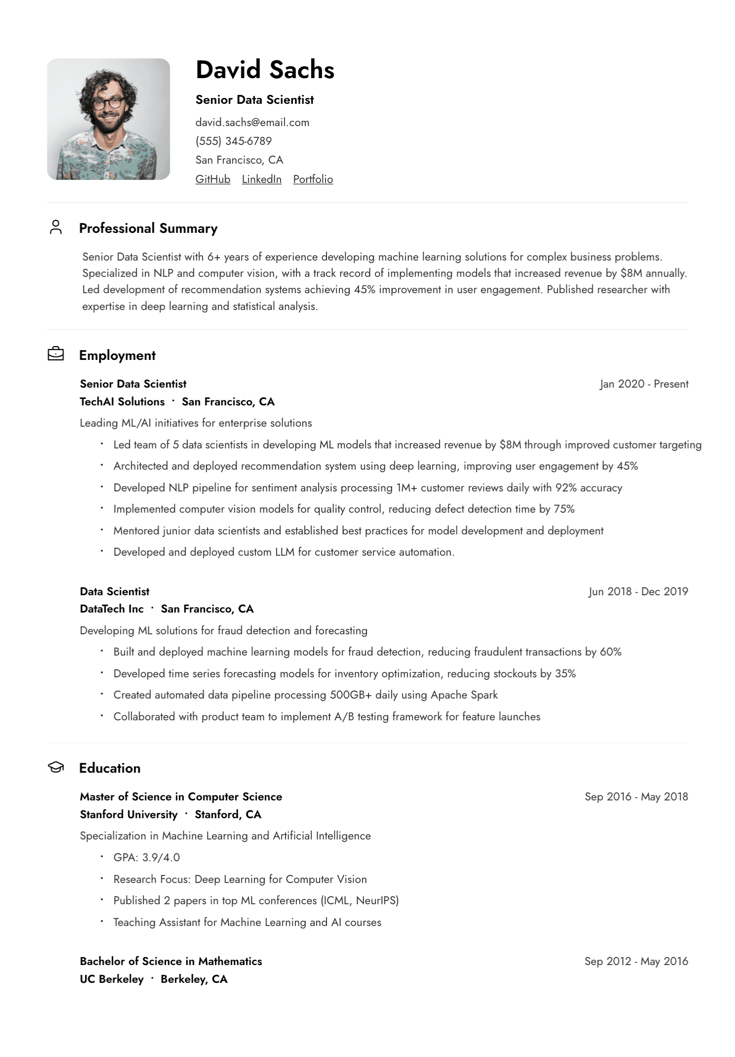
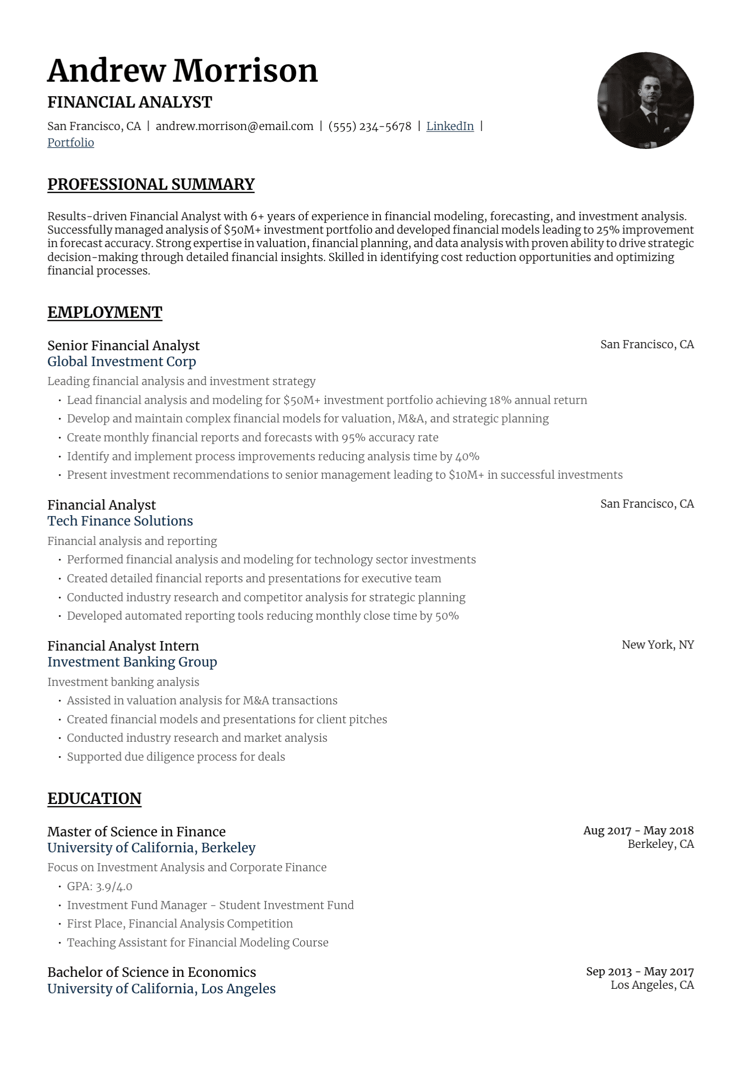
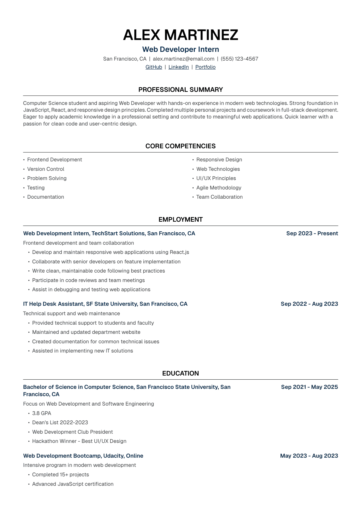
A clean single-column format remains the safest general choice when you have no information about the employer’s process.
Keep Human Attention and ATS Parsing Separate
Eye-tracking research studies human vision. Applicant tracking software stores and processes resume data. A visual hot zone has no special technical meaning to an ATS.
For parsing, use selectable text, follow the requested file format, choose clear section names, write dates consistently, and include relevant terminology truthfully. Check that text extraction preserves the reading order.
For human readers, create visible hierarchy, prioritize relevant evidence, keep the language concise, and leave enough white space.
Both audiences benefit from clarity, though they process the document differently.
Run a Simple Scan Test
Ask someone who understands the target field to look at your resume briefly. Then hide the document and ask:
- What role did you think I was targeting?
- What level did I appear to be?
- Which achievement did you remember?
- Which skill stood out?
- Where did the page feel crowded or confusing?
This exercise offers practical feedback on your document. It provides no scientific heat map, and it can still reveal whether your hierarchy works.
What the Research Means for Your Resume
You cannot control the exact amount of time a recruiter spends with your application. You can make the relevant evidence easier to recognize.
Use clear headings. Make titles and dates easy to find. Lead each role with strong evidence. Cut dense prose. Keep the layout calm. Give an interested recruiter a document worth reading beyond the first scan.
UseResume provides editable resume templates and PDF export, so you can organize your experience in a clear document and review the final layout before applying.
Create your account and build a resume designed for clear, confident reading.
Continue with our guides to choosing a resume format and deciding between one and two pages.